Ligo Sardines
Brand Identity, Brand Refresh, Packaging Design
Since its founding, Ligo has been a pioneer in the Philippines’ canned fish industry. For more than 60 years, they have made it their mission to provide each and every Filipino with nutritious high quality canned food goods that gives outstanding value.
With their long track record as an industry leader, Ligo was ready to once again lead the way in the sardine market.
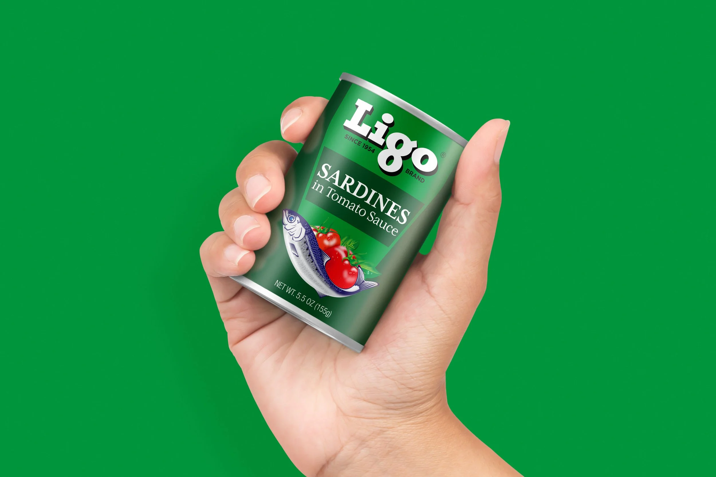
We introduced a unique holding device inspired by the shape of a sardine can tab—an everyday gesture made memorable. By referencing the simple act of opening a can, we created a visual cue that’s instantly recognizable and distinctly Ligo. In doing so, we transformed a common gesture into a powerful brand signature.
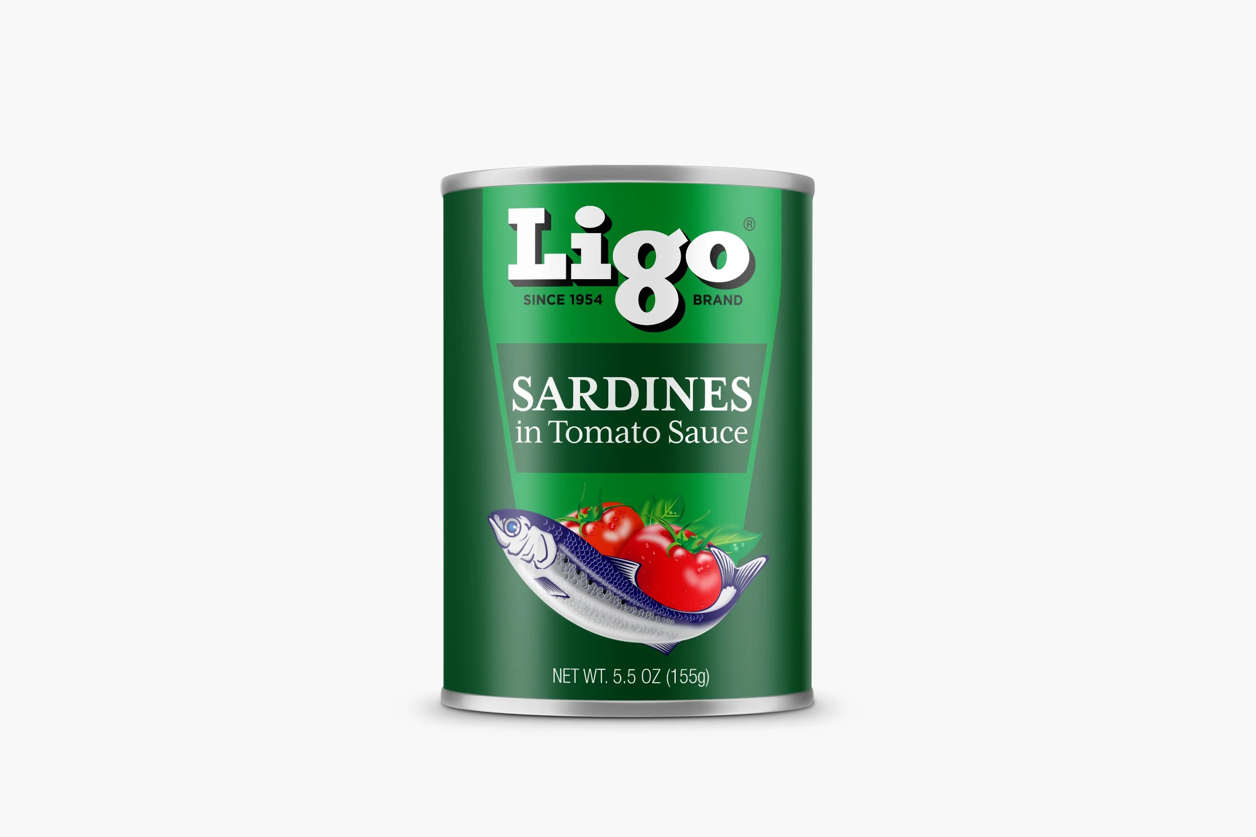
It was essential that the brand’s strongest asset—its legacy—was kept intact. With that in mind, the Ligo typeface was updated for the modern marketplace. The new typeface maintains the unique qualities that consumers have come to love.
Cutting through the noise and clutter, we leveraged the core qualities of their brand equity in the latest refresh. The new brand architecture is cleaner, rich in colour, and brings food photography to the forefront allowing it to be easily adaptable for the future.